BrantPole: designing safer nights in downtown Brantford
A real brief from the Workforce Planning Board of Grand Erie. We went from field research to a street pole that works without a phone, testing it at every fidelity: cardboard, Figma, 3D and VR.
- NeedClient briefFour concerns
- ResearchSurvey, interviews, fieldAffinity map
- DefineUsers and goalsStoryboard
- EvolutionSketch → 3DUsers, expert, policeTEST
- Hi-fiFinal 3D + screenAccessibility
- VRSimulation+ working prototype
TESTEach round of feedback fed the next model.
The brief: a downtown people avoid after dark
The client came with four concerns about downtown Brantford. We chose to focus on one principle from the ICF Canada Smart City Framework: safety.
People feel unsafe on the streets at night
Transit and public space are poorly connected
The Laurier campus feels cut off from the city, and any fix must stay inclusive of people experiencing homelessness
Few people use SAFEHawk, the existing safety app
help students, seniors, residents and commuters feel safe walking downtown at night, without relying on a phone app?
Listening to the people who walk there
Three methods, then an affinity map to sort what we heard into themes.
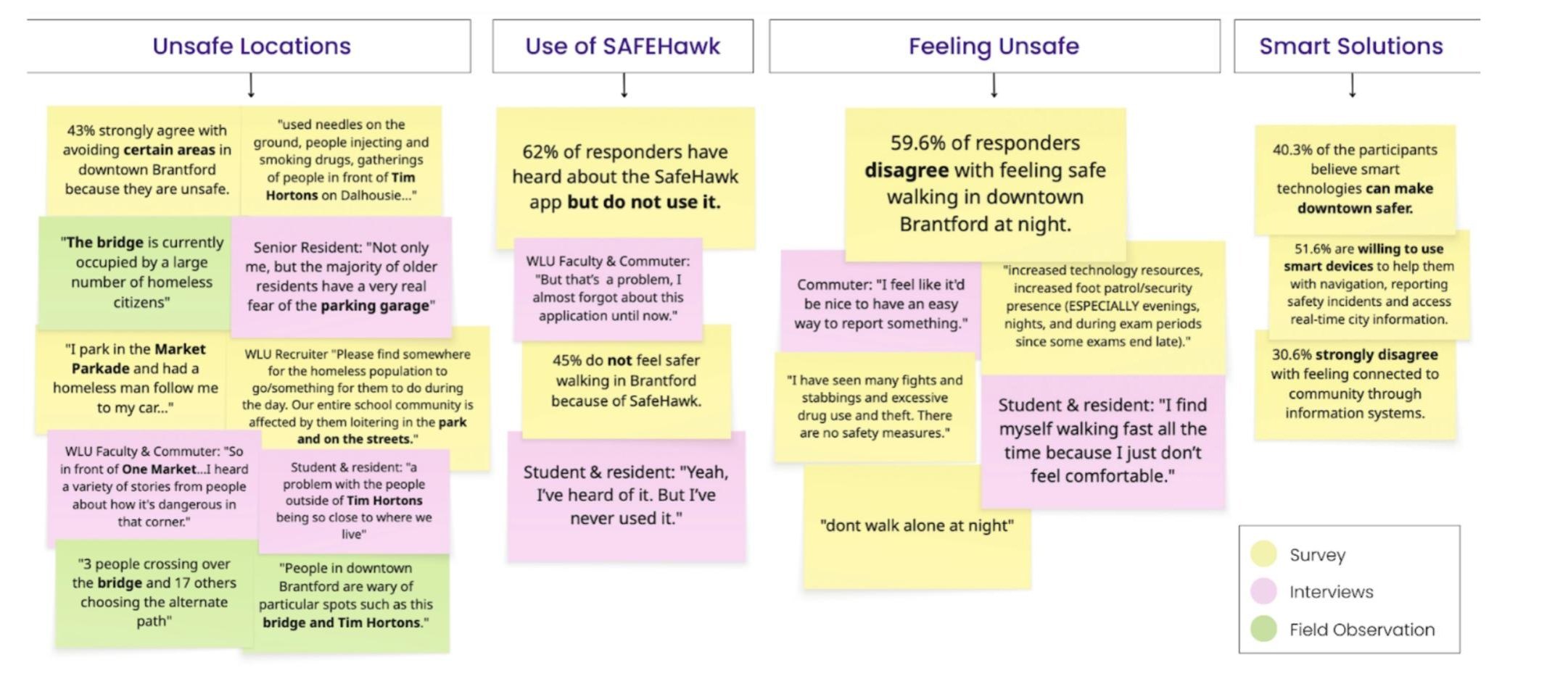
What we heard
- The same places came up again and again: the bridge, the parking garage, the corner outside Tim Hortons.
- People knew SAFEHawk existed but did not open it. “Yeah, I've heard of it. But I've never used it.”
- Feeling unsafe changed behaviour. “I find myself walking fast all the time because I just don't feel comfortable.”
- People wanted a simple way to ask for help. “I feel like it'd be nice to have an easy way to report something.”
Design implications
A physical tool that does not depend on a phone
Better lighting where people feel exposed
Infrastructure that reacts to context
Help people find their way
Quiet features that do not alert a threat
Who it is for, and what “good” means
Increase the sense of safety downtown
Inclusive and usable for all users
Help Brantford become a smart city
Doable to build and to maintain
How the pole took shape, in four steps
Each version was cheap enough to change and real enough to test. What users and experts said at one step shaped the next.
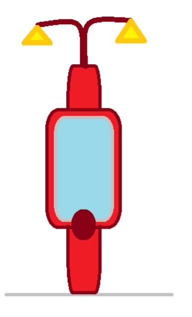
Step 01SketchA street light with a screen and one big button. 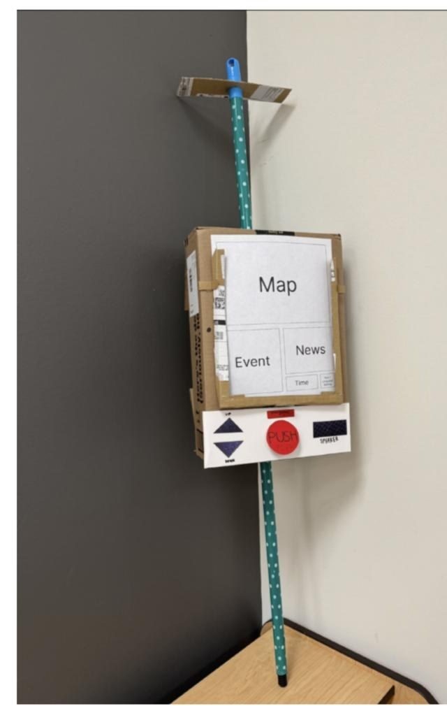
Step 02CardboardReal buttons and braille you can press, plus the screen flow in Figma. 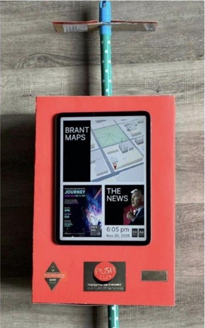
Step 03Working prototypeA painted pole with an iPad, so people could try the maps, events and alarm. 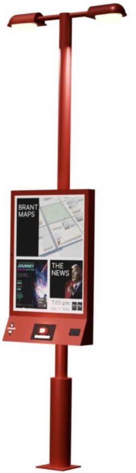
Step 043D modelReal proportions, height and materials, ready for the final design.
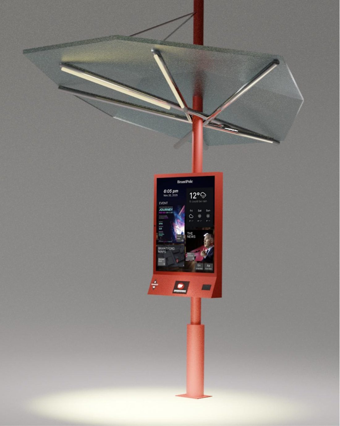
Final 3D model: three features in one pole
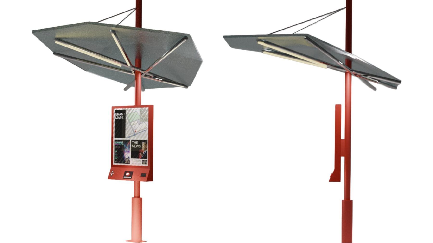
Ask for help without a phone
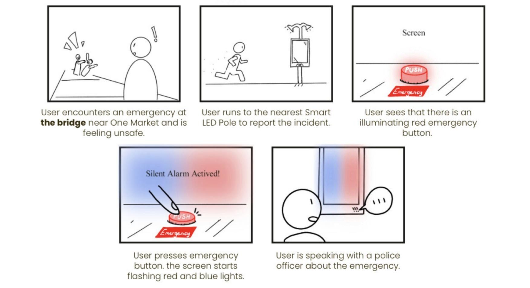
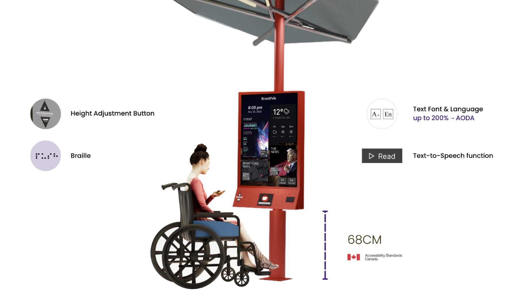
An illuminated red button with braille. A one-way camera, speaker and microphone connect the user to an officer.
Light that reacts to people
LED sensor strips under a protective shield. At night they turn on when someone is within 2 metres, and the canopy shelters the screen from weather.
Maps, events and news
Way-finding to nearby businesses, city events and local news, so the pole is useful every day, not only in an emergency.
Standing next to it before it exists
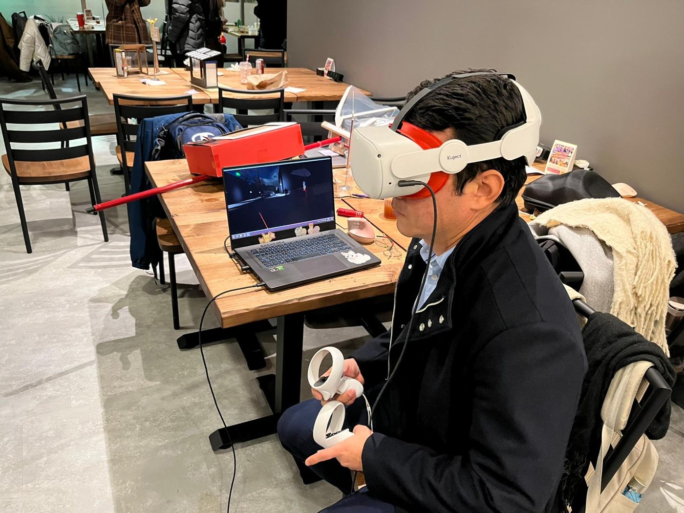
We built a night-time street and the pole in Unreal Engine and tested the final concept in VR. A user walks up, reads the screen, then presses the emergency button: a silent alarm first, then hold for a loud one.
Showcase day
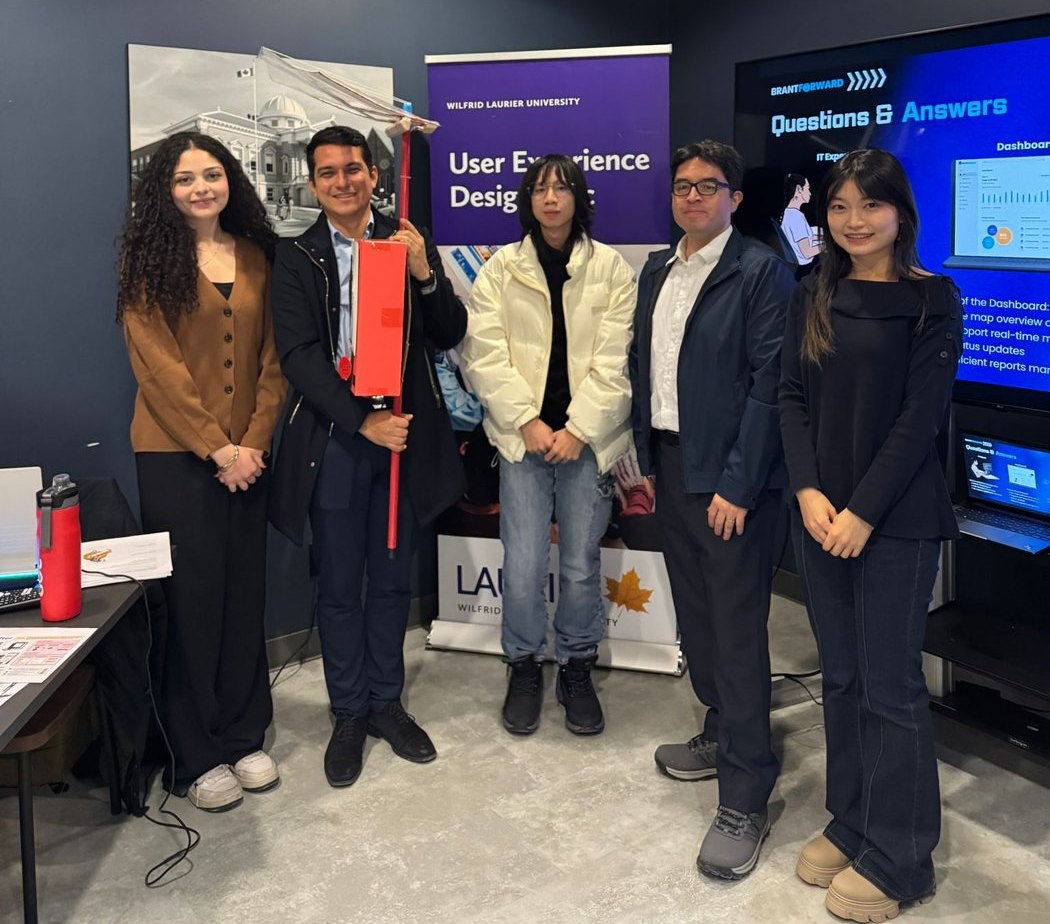
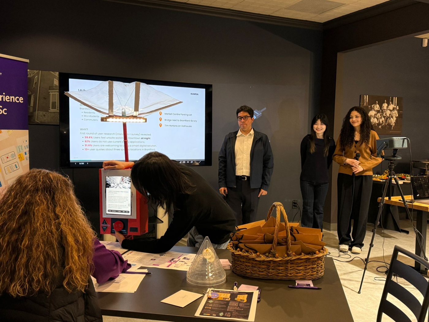
We presented BrantPole at the Laurier UX Design MSc showcase, with the prototype on hand and the VR simulation open for guests to try.
How we worked
Test at every fidelity
Cardboard, Figma, 3D and VR each answered a different question. Cheap prototypes let us change direction early.
Design with stakeholders, not only users
A police officer and an engineer shaped the camera, the alarm and what was realistic to build and maintain.
Inclusive by default
Accessibility followed Canadian standards from the start: AODA text sizing, screen height for wheelchair users and braille.