Serena ZhangLaurier work · 01 / 02
UX605 Prototyping · Wilfrid Laurier University · 2026

Echo: an AI companion that listens first

A mobile app for everyday emotional support. Users create their own AI companion, talk to it by text or voice, meet it in AR and keep a mood diary. We took it from research to a tested high-fidelity prototype.

ResearchPersonasLo-fi to hi-fiVisual designUsability testing
Type
Course project, high-fidelity prototype
Team
4 designers: Carol Chen, Qiaohui Xu, Si Zhang, Aileen Zhou
Tools
Figma, Figma Make, Zoom, Google Sheets, AI tools for concept art and analysis
Scope
5 core flows, about 20 key screens
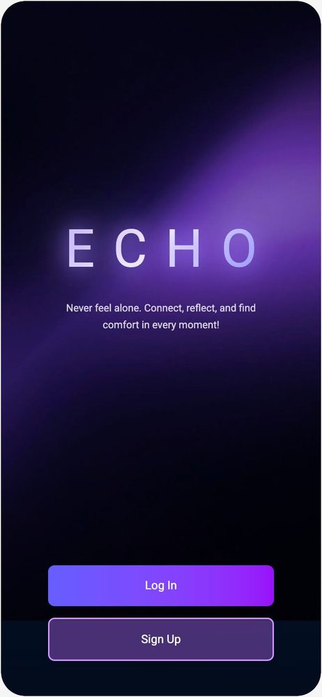
Echo splash screen: the ECHO wordmark on a dark purple gradient with Log in and Sign up buttons
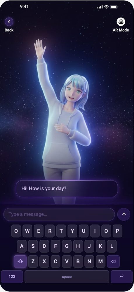
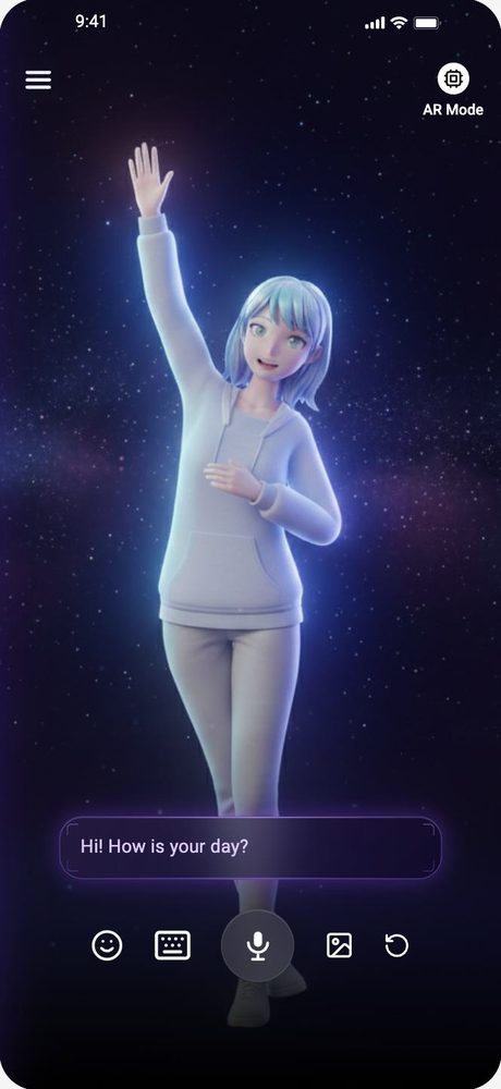
Main chat screen with the 3D companion waving and the message bubble Hi! How is your day?
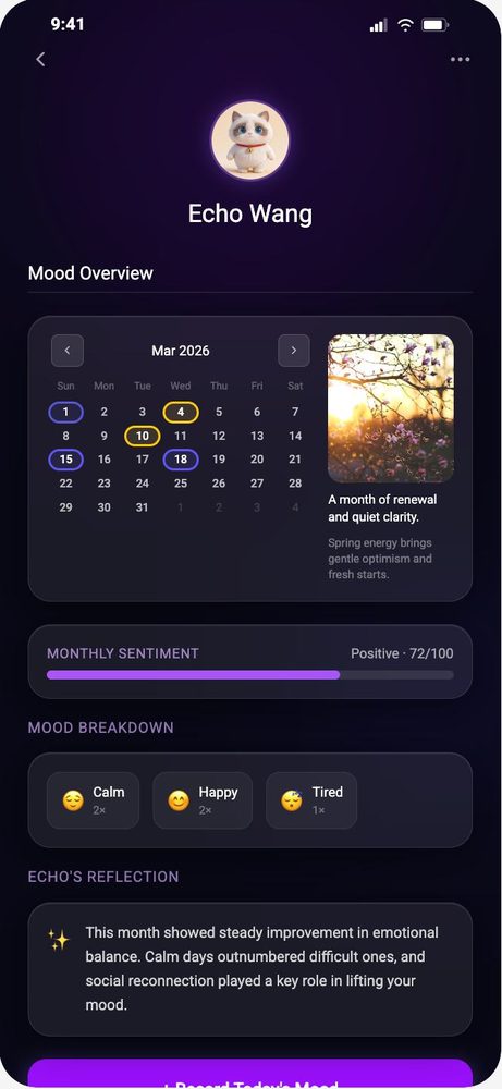
Mood overview with a monthly calendar, sentiment bar and mood breakdown
4personas built from interviews and secondary research
5core tasks tested with first-time users
19/20task runs fully completed (1 partial)
91.7average UMUX-Lite score out of 100
Research

Who needs a companion, and what makes them trust one

We started with secondary research on emotional-support apps and accessibility, then ran interviews and synthesized them with affinity mapping and a journey map. Four personas came out of it. Two are shown here.

Andy

21 · Calgary · heavy online gamer
“It's probably because of my lack of confidence in describing my emotions and feelings. Like the biggest struggle from getting emotional support.”
Needs
Passive companionship, social mediation, validation during conflict
Context
His social life lives in Discord and in-game voice. Daily social needs are met online, deeper support is missing.
Design cue
Lower the effort of expressing feelings: voice input and one-tap mood icons.
David

25 · Toronto · night owl, pragmatic AI user
“If I feel like it's an AI, chatting with it feels very weird… It should just provide emotional comfort, not specific advice.”
Needs
Simple stress relief, non-prescriptive comfort, efficiency
Context
Uses AI tools for work every day but keeps them apart from emotional life. Skeptical of robotic responses.
Design cue
Comfort before features, and a companion that feels human enough to talk to.

The other two personas are Margaret and Mia. Interviewee photos are left out to protect their privacy.

From wireframe to prototype

Low-fi to mid-fi to hi-fi

We mapped every flow in grey boxes first, tested the logic, then moved to dark mid-fi screens with the companion in place before polishing the visuals.

Lo-fiGrey wireframes · every flow and branch
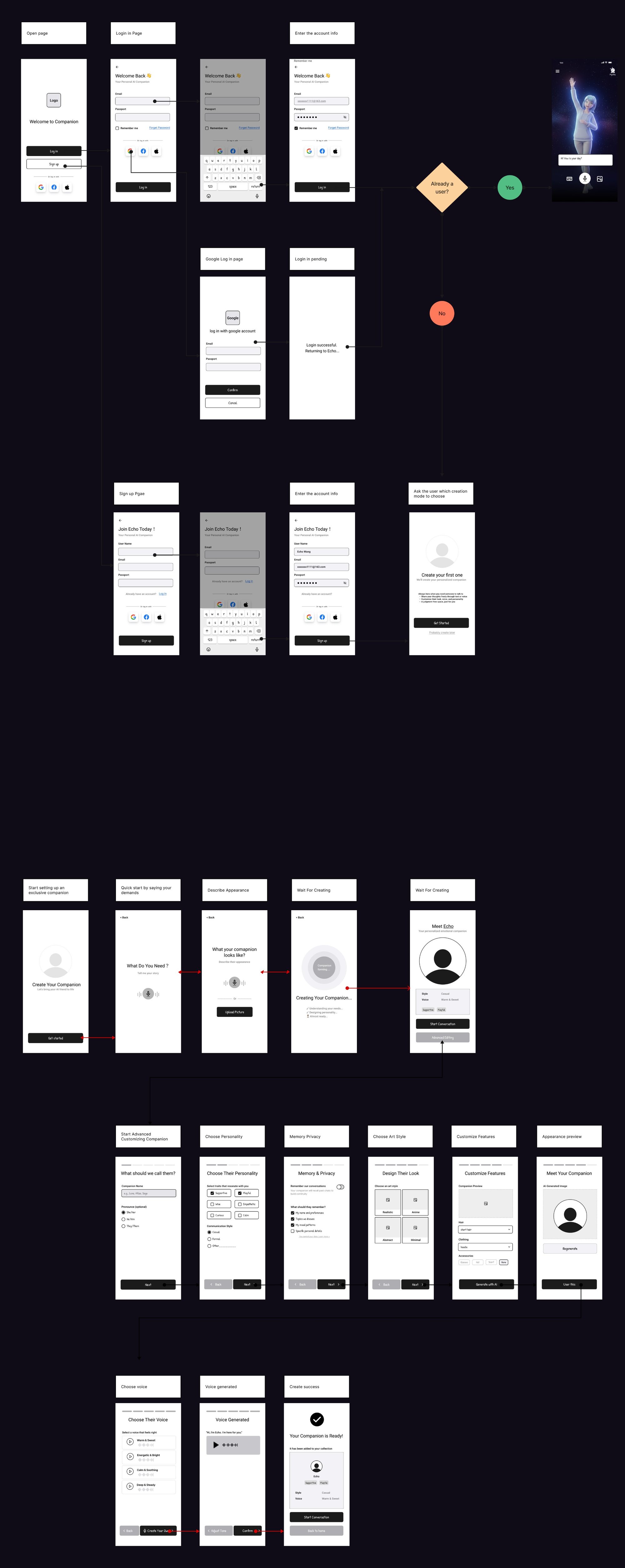
Lo-fi user flow in grey wireframes: welcome, log in, Google log in and sign up, then Quick Create and Advanced customization for name, personality, memory, art style, features, appearance and voice, ending in Your companion is ready
Mid-fiDark screens · the companion in place
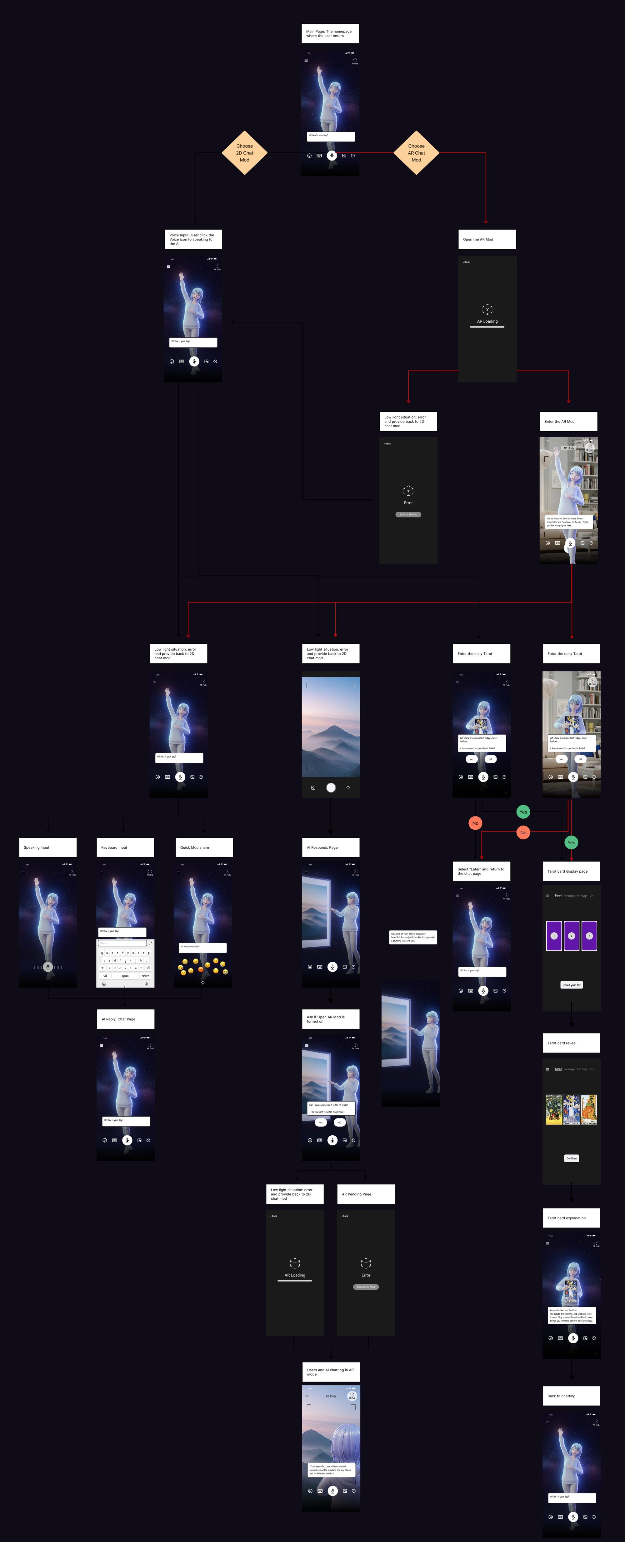
Mid-fi user flow on dark screens with the glowing companion: 2D and AR chat modes, voice, keyboard and mood input, AR loading and low-light errors, and the daily tarot flow

Click either flow to open it full size.

Visual direction

A night sky, a soft glow and a companion who feels present

The look had to feel calm late at night, not clinical: a deep violet night palette with aurora highlights, and a soft, glowing 3D character so the companion feels warm rather than robotic.

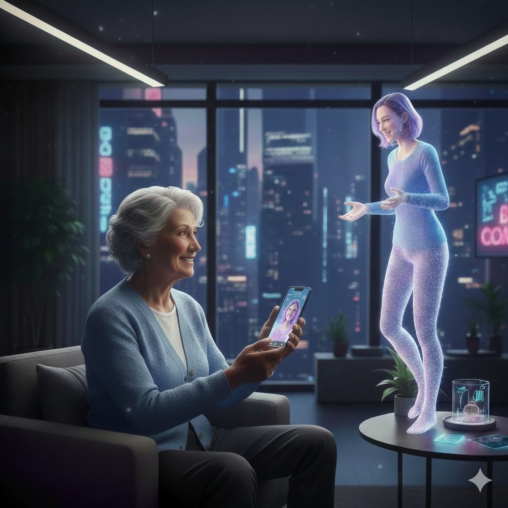
Concept image: an older woman on a sofa smiling at her phone while a glowing companion stands beside her
Use scene · companion at home
The companion touching a window that looks out on misty mountains
AR mode concept
The companion seen from behind, looking at a sunrise over mountains
Mood · calm

Character and scene concepts were generated with AI tools, then selected and placed into the interface by the team.

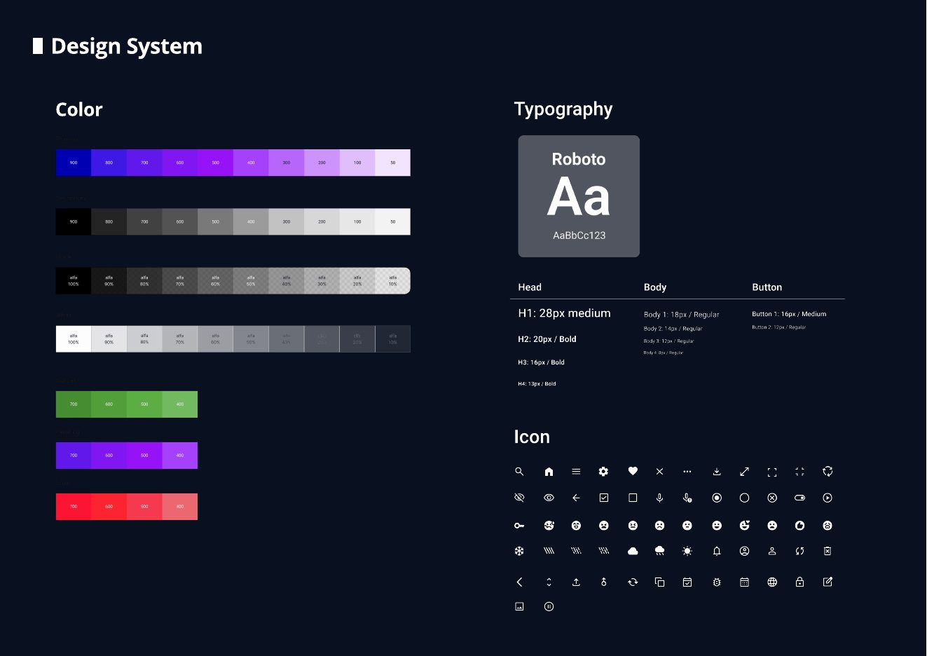
Design system page: color scales in violet, grey, green and red, Roboto type scale and an icon set
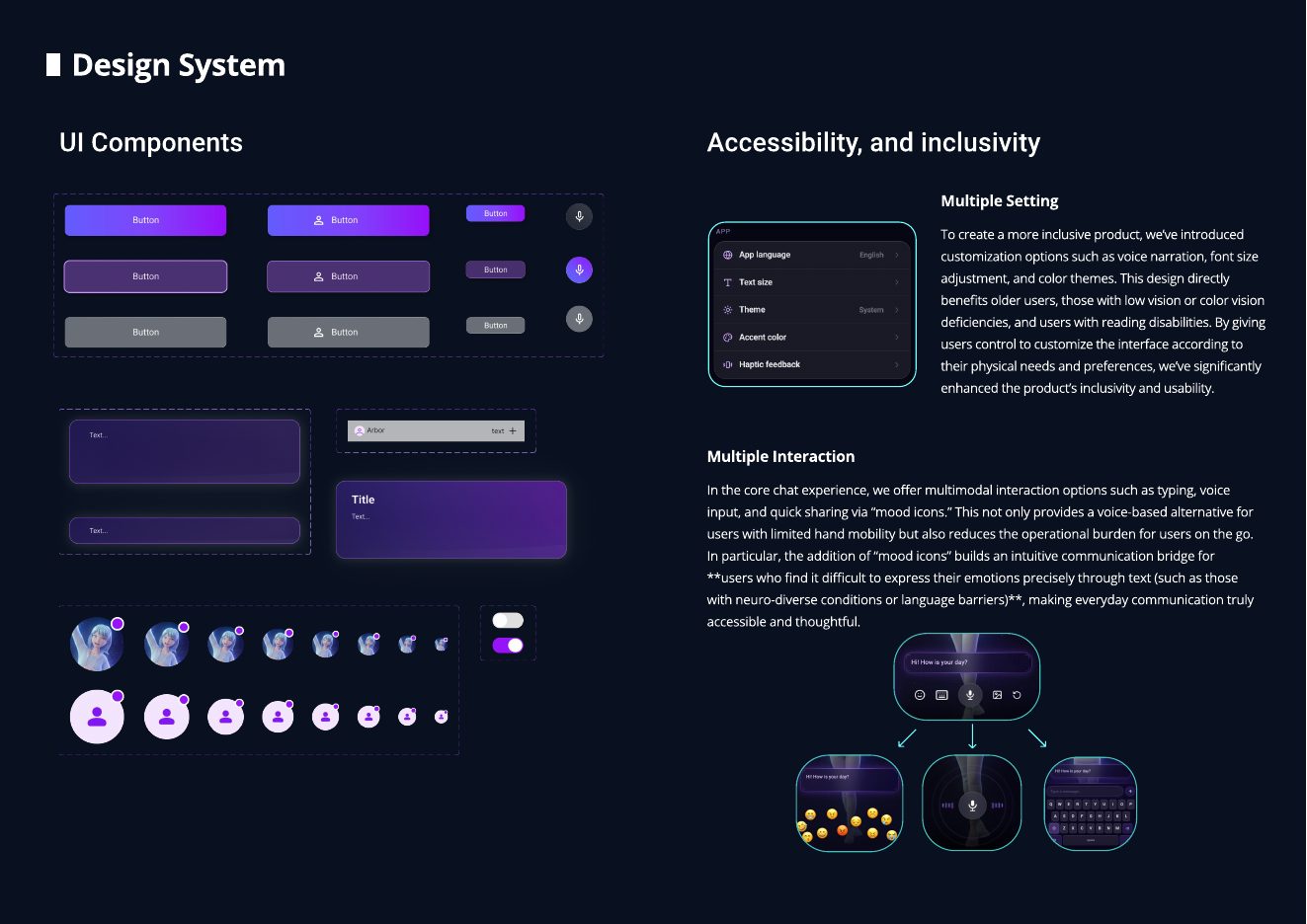
Design system page: buttons, inputs, cards, avatars, toggles and accessibility settings

Design system: color scales, Roboto type scale, a 60-icon set, components, and accessibility settings for text size, theme, voice output and multimodal input.

High-fidelity prototype

Five flows, one calm voice

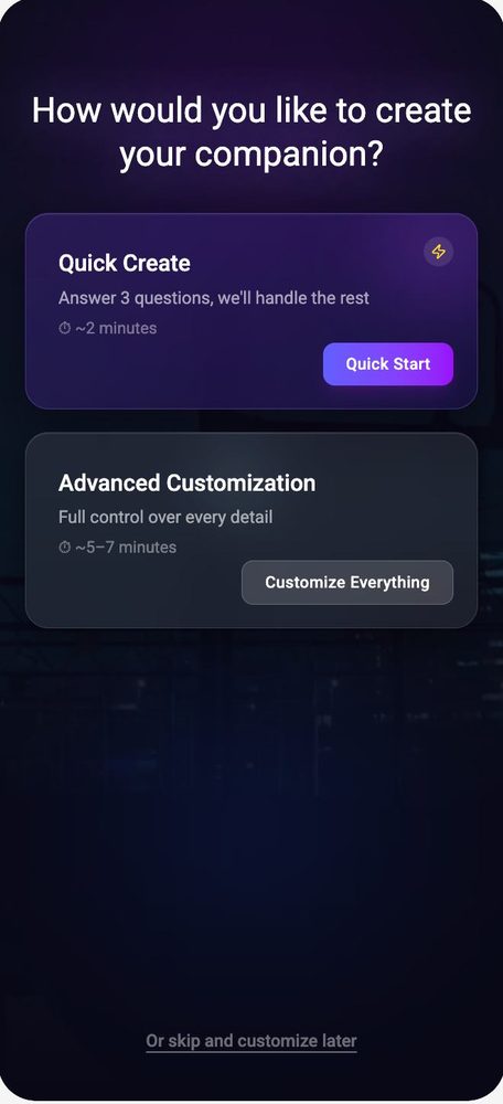
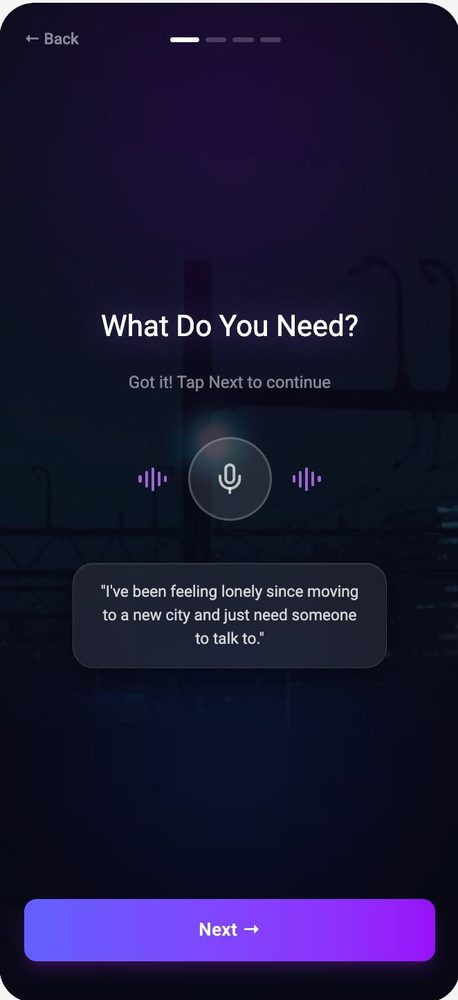
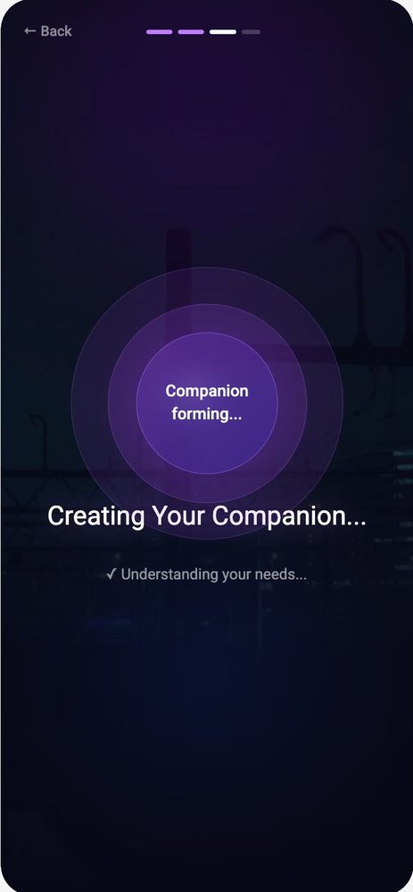
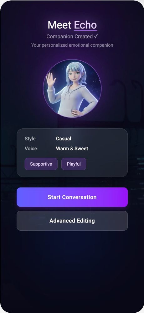
Create a companion

Quick Create asks 3 questions. Advanced lets users shape every detail.

How would you like to create your companion? Quick Create or Advanced Customization
Choose a pathAbout 2 min or 5 to 7 min
What do you need? screen with a voice button and the reply I've been feeling lonely since moving
Say what you needVoice first, typing optional
Creating your companion loading screen with a glowing orb
Companion formingFeedback while it builds
Meet Echo card with style Casual, voice Warm and Sweet, Start Conversation button
Meet EchoReview, then start talking

Talk it through

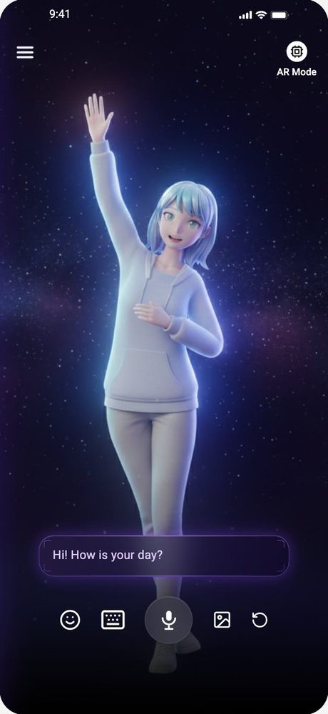
Text, voice or a mood icon, for moments when words are hard.

Chat with keyboard open
TypeMessage stays above the keyboard
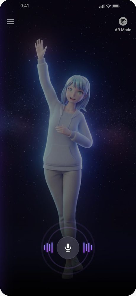
Voice input with a waveform around the microphone
SpeakHold to talk
Row of emoji mood icons floating above the input
Share a moodOne tap instead of a sentence
Companion replies Your feelings are valid. I'm here to support you through this.
Feel heardEmpathy before suggestions

AR, diary and personal settings

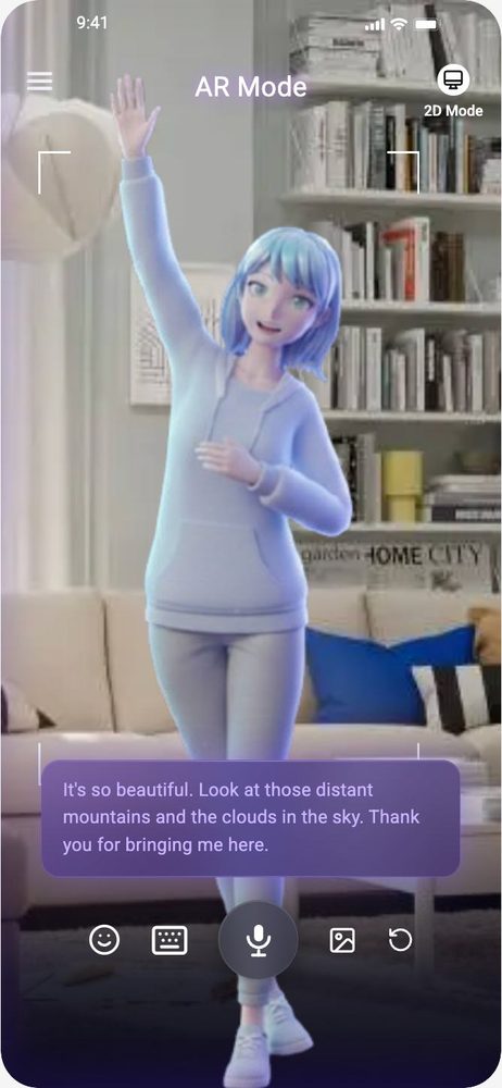
The companion steps into the room, the diary shows the month, settings adapt the app.

AR mode: the companion standing in a real living room
AR modeCompanion in your space
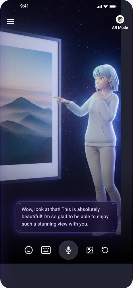
Companion pointing at a window with mountains, sharing the view
Share a viewSend a photo, get a reaction
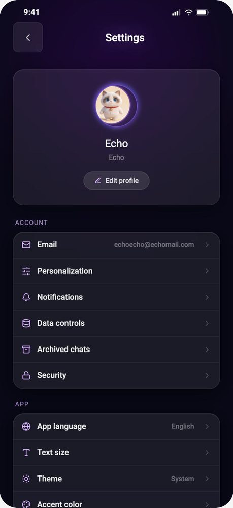
Settings screen with account, app language, text size and theme
SettingsText size, theme, language
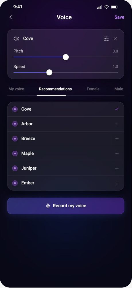
Voice settings with pitch and speed sliders and voice list
VoicePick and tune a voice
Usability testing

Four first-time users, five tasks, think-aloud

Moderated remote sessions over Zoom. Each participant signed up, created two companions, sent text and voice messages, used AR, recorded a mood entry and changed three settings.

Moderated + think-aloudFacilitator, observer and recorded sessions, about 30 minutes each
SEQ after every task1 = very easy, 7 = very difficult, plus time on task and error counts
UMUX-Lite after the testWe also ran an AI-simulated user pass to cross-check problem areas

Bars show average time on task. Tasks 3 and 4 had the highest difficulty ratings. UMUX-Lite averaged 91.67, with one participant giving 100.

Findings and redesign

What broke, and what we changed

Finding 1 · emotional timing

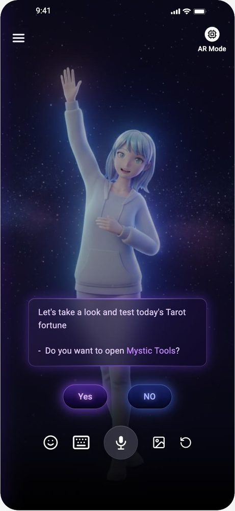
The AI pushed a feature when the user needed comfort

When a participant described a stressful day, the companion offered a tarot reading. Task 2 had four operational errors and the AI tool flagged it as the highest-risk moment.

“I just poured out my feelings about having a stressful day, and the companion completely ignored my emotional state to suggest a Tarot reading.”

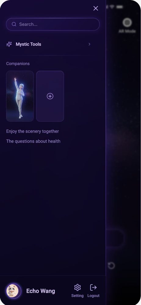
We removed the automatic pop-up and moved tarot into a “Mystic Tools” entry in the side menu, so users open it when they want to.

Before
Before: a pop-up in the chat asks Do you want to open Mystic Tools? with Yes and No buttons
After
After: the side menu lists Mood Diary and Mystic Tools as user-initiated entries
Finding 2 · findability

The mood diary was hard to find and had no clear next step

Task 4 had the worst SEQ (2.25). The diary lived only inside Profile, and the calendar looked like a report with no obvious way to add an entry. We added a Mood Diary entry to the side menu and a clear “Add Mood Diary” button on the list and calendar.

Finding 3 · wording

Vague labels and jargon raised the learning curve

One participant thought they had to finish the avatar before being logged in. Another did not know what “The Cross” spread meant. We rewrote onboarding copy and added short in-context hints.

Create Your CompanionCustomize your AI avatar
The CrossSelect 3 cards
What I took away

Designing for feelings

Timing is part of the interface

The same feature can feel helpful or rude depending on when it appears. Emotional state should gate what the product offers.

High scores can hide friction

UMUX-Lite was above 90, yet think-aloud showed hesitation in AR and the diary. Watching people matters more than the score.

Less jargon, more guidance

Small copy changes, like naming the action instead of the concept, removed confusion that no visual polish could fix.